Alex davison // marketing, Content and creative portfolio
Building a Content Strategy Around Virality
Digital marketing with permanent (JOy)
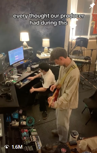
Promotional social media video for single release, November 2024, via Instagram. Now on 1.6m views.
In November 2024, a low-budget behind-the-scenes video of the band recording unexpectedly hit 1m views. We were in the middle of a release campaign, but this moment made us pivot on our entire digital strategy.
THE VIDEO
What made this video work? Unpolished, relatable, BTS access into the band's real process, not high production performance content. Audiences liked the self-aware, comedic, and authentic POV of our work. This became the foundation for the band's ongoing content strategy.
THE INSIGHT
I built a recurring format around rehearsals, recording sessions, and the content-creation process itself — leaning into the DIY nature of production. This meant constantly filming and repurposing BTS moments as short-form content, prioritising authenticity and speed over production value, while maintaining our voice - the self-aware, tongue-in-cheek tone.
THE STRATEGY
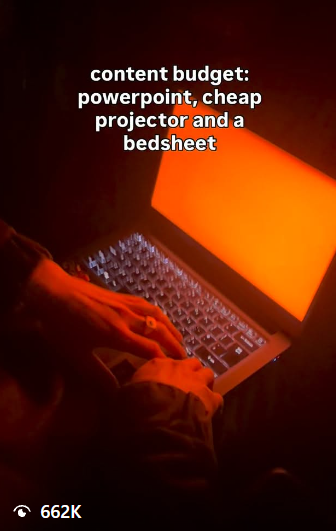
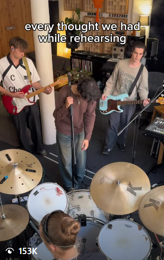
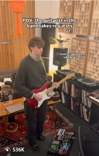
A BAND CANNOT LIVE ON VIRALITY ALONE
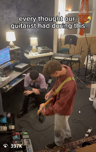
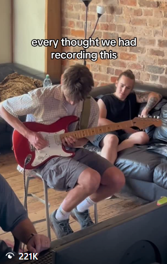
Examples of follow-up videos that formed the core of our social media content and digital marketing strategy over the next two EP release campaigns, via Instagram.
The most consistent feedback we received from industry personnel who reached out to collaborate was that they discovered us through these viral, low budget BTS videos, but it wasn’t these videos that convinced them to stick around. These videos pulled them in with their catchy hooks and witty style, but it was the distinct artistic branding seen throughout the rest of our profile that proved we had something coherent, creatively confident, and ready to market.
The strategy had been simple and effective: hook in viewers using the simplistic iPhone videos that played to the stylings of platform algorithms, but bring them to a page that was artistically rich, that represented immediately and clearly the band’s creative identity. Our viral content strategy brought people in the door, and the key to making them stay was building a world that they could join.
THE RESULTS
Follower count has since grown from roughly 5,000 to 25,000 — a 400% increase — with multiple follow-up posts in this format independently reaching hundreds of thousands of views. We were scouted online by A&R from major labels, and secured opening slots for major touring acts like Blossoms, Franz Ferdinand, and Inhaler.
visual identity & art direction
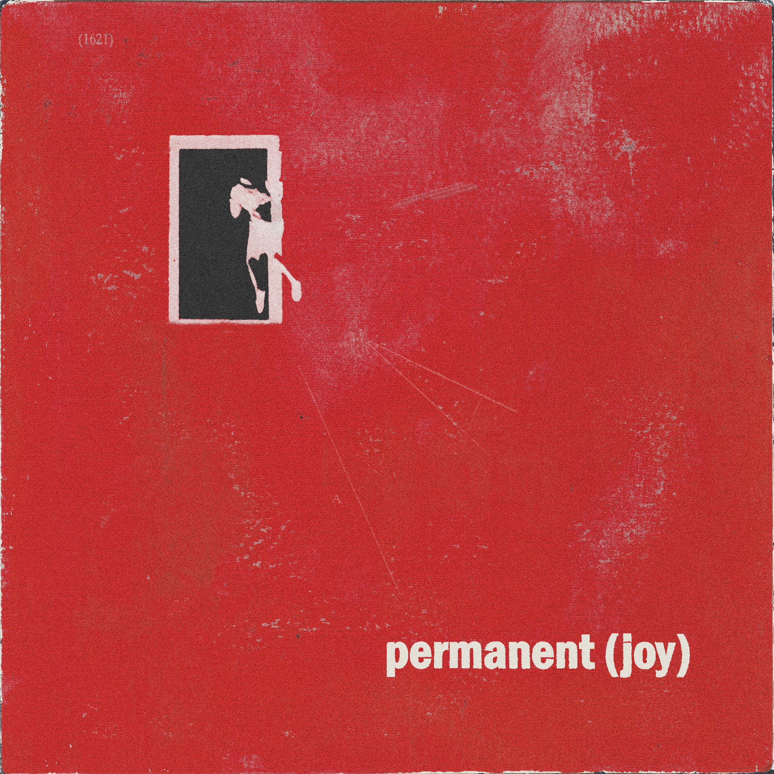
despair will make me a modern man (2025)
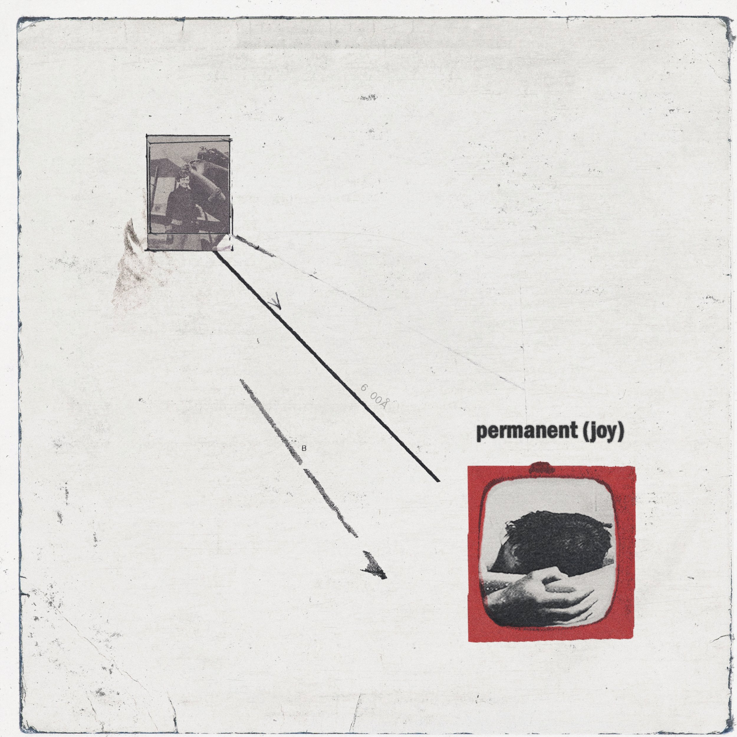
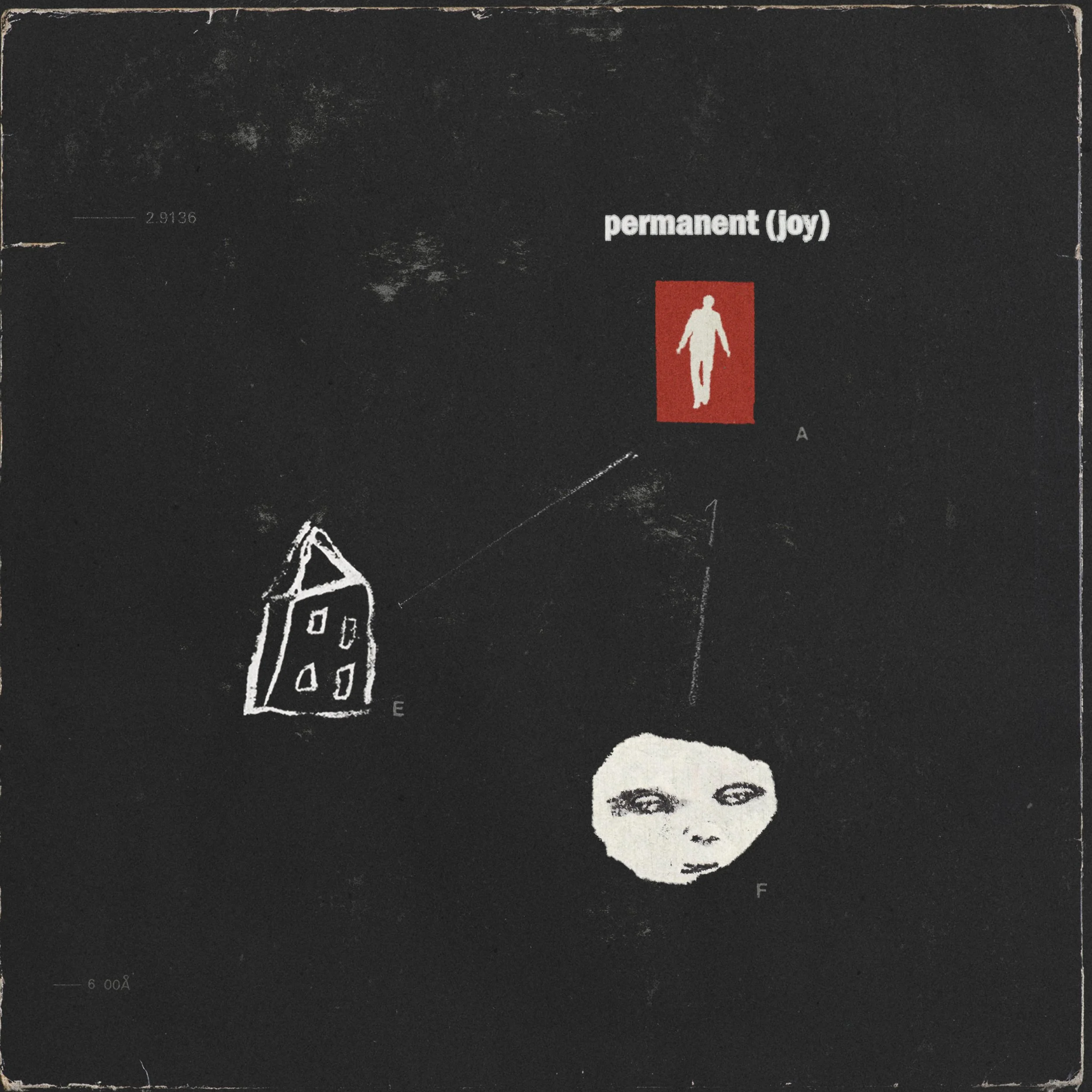
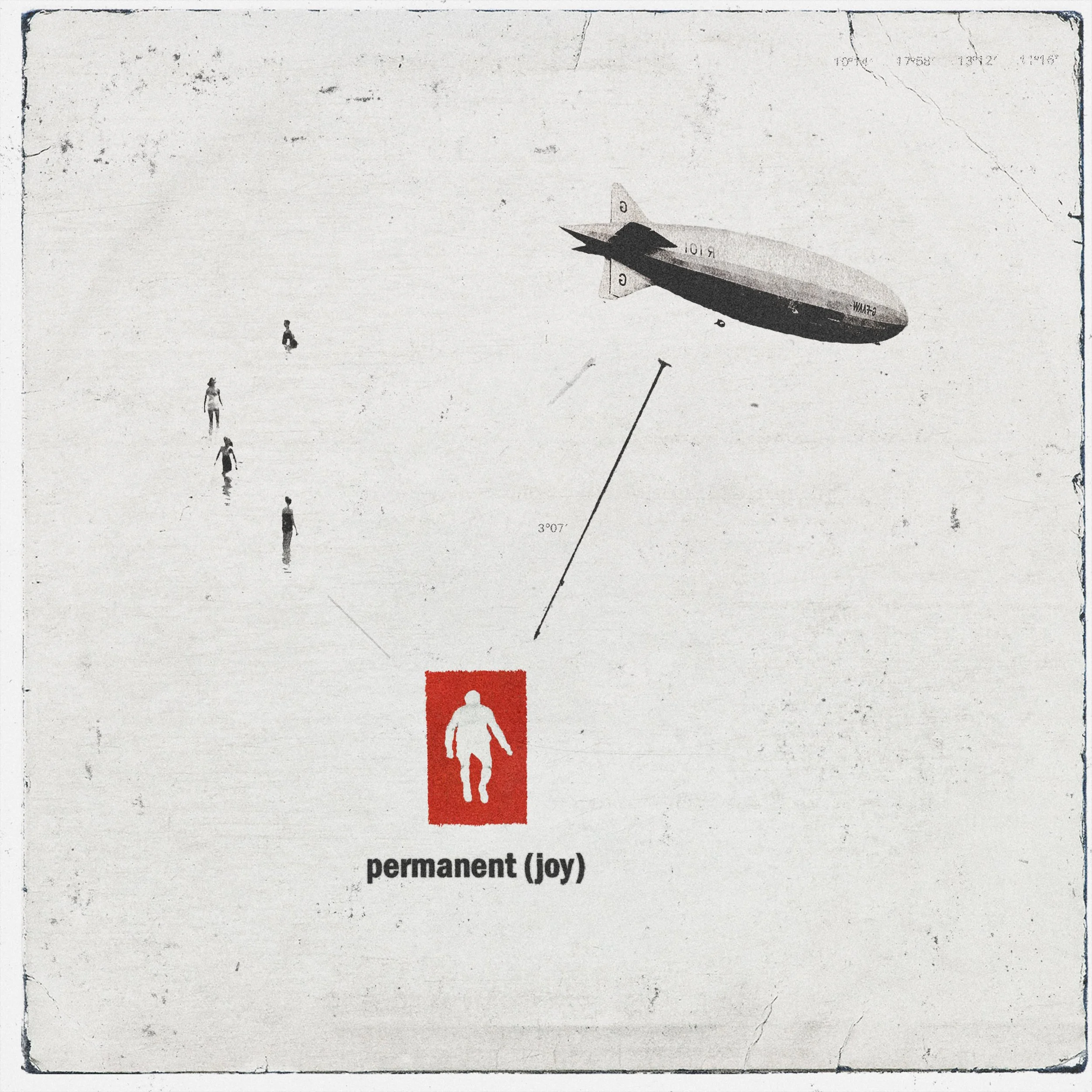
The band’s debut project was a concept EP built around a loose narrative of love and loss, with lyrics exploring death, religion, and the afterlife. Inspired by concept albums like Pink Floyd’s Wish You Were Here, Radiohead's OK Computer, and Neutral Milk Hotel's In The Aeroplane Over The Sea, I wanted to avoid literal storytelling in the visuals, instead conveying meaning through vignettes of feeling and surrealist fragments.
DEBUTING WITH A CONCEPT
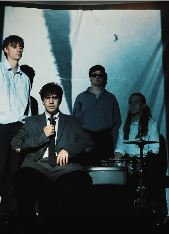
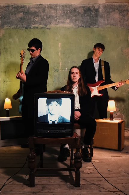
“An art style that communicated the refraction of life through memory; the fragmentation inherent in trying to make permanent all that is temporary.”
I designed the cover artwork myself, using collaged imagery, distressed textures, and a recurring vintage television motif, representing the way memory refracts and fragments the people and moments we try to hold onto. This same motif carried through into the photography and video I directed: old CRT televisions appear as physical set pieces within decaying interiors, and formalwear is placed in settings of visible disrepair, a tension between composure and collapse that echoes the project's themes.
THE VISUAL LANGUAGE
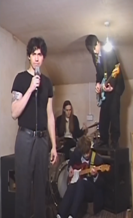
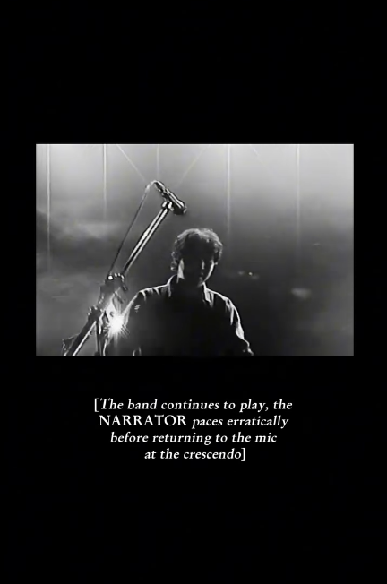
Above: Stills from promotional videos used during EP1. I wanted to upend the traditional process of creating classic music videos and cropping them down for socials after the fact, and instead designed and filmed all our visuals to be vertical at the outset. This produced an exciting visual format we hadn’t seen used by many bands at the time.
A number of creative decisions during this campaign were inspired by the limitations faced in attempting something bold and artistically coherent with a shoestring indie budget. The visual direction of the artwork came from sourcing cheap collage material in vintage magazines and second-hand bookstores, while the supporting social media content was financially limited to conceptual sketches of short song sections. Without the budgetary means to film whole music videos in traditional format, we went straight to vertical, creating something adjacent using free or cheap resources we found ourselves. A friend’s house mid-replastering became a set location, suits were borrowed to add a sense of elevation and disconnection to the setting, and old CRT monitors were recycled into a recurring prop.
EMBRACING LIMITATIONS
brand evolution & scaling the product
role models (2026)
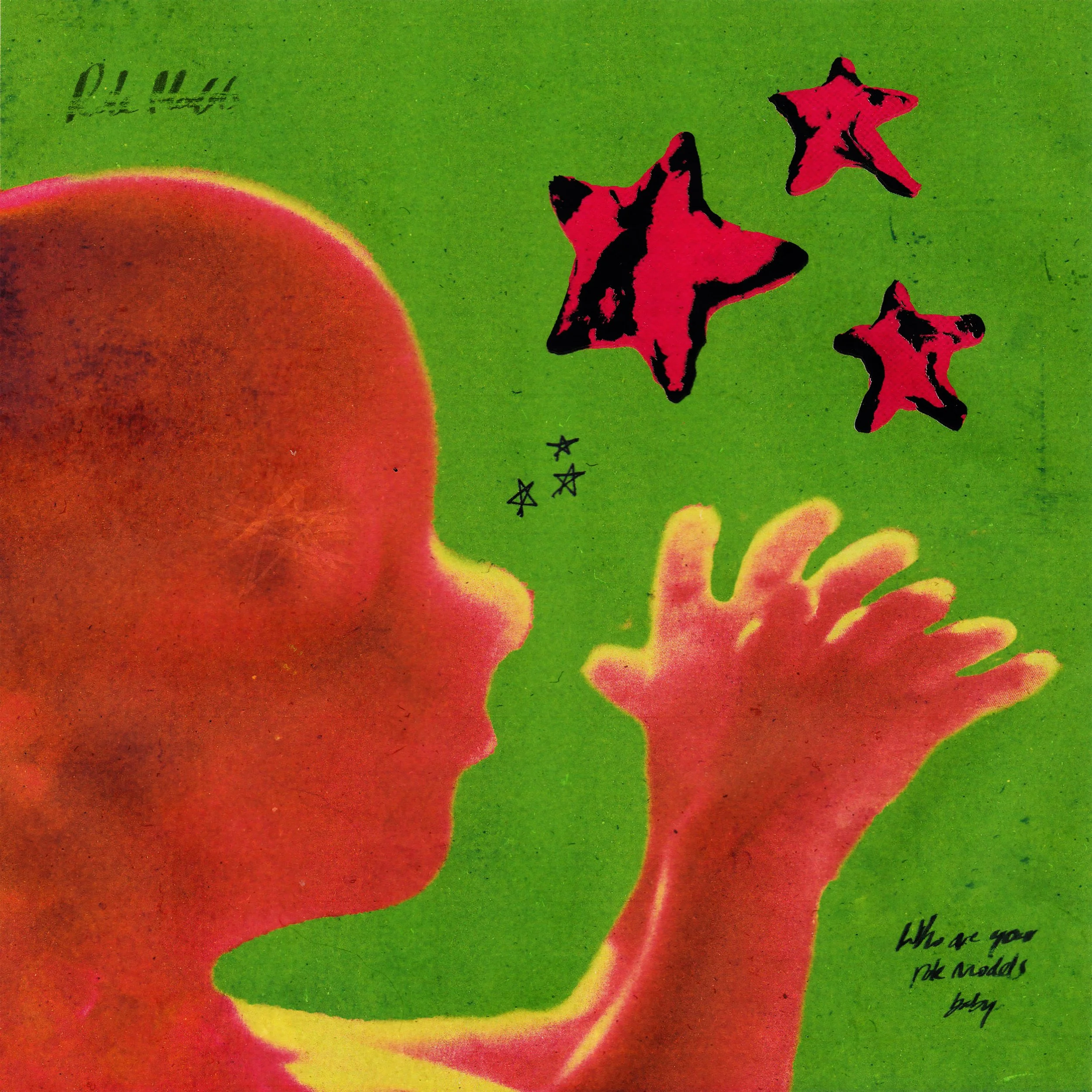
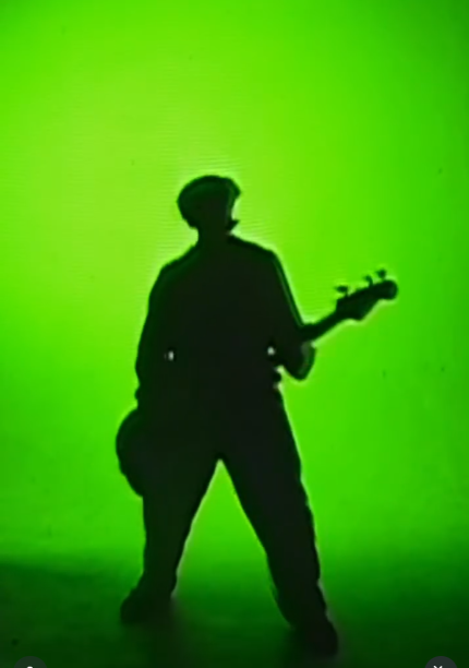
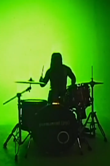
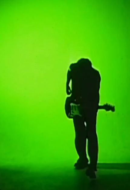
After touring our first EP opening large venues for indie stars Franz Ferdinand, Blossoms, and Inhaler, we realised we needed more energy in our live set to win over unfamiliar crowds. The lead single from the second EP, then, meant a total reinvention. “Role Models” was a track that was punchy, satirical, and unapologetically loud. Musically influenced by Nirvana, The Dandy Warhols, The Breeders, and Blur, the song's brash energy demanded an equally brash visual identity.
BACK WITH A BANG
Below: Stills from the “Role Models” promotional video, which used green lighting and a camcorder to distort the band into punchy, posterised silhouettes that echoed the style of the cover sleeve.
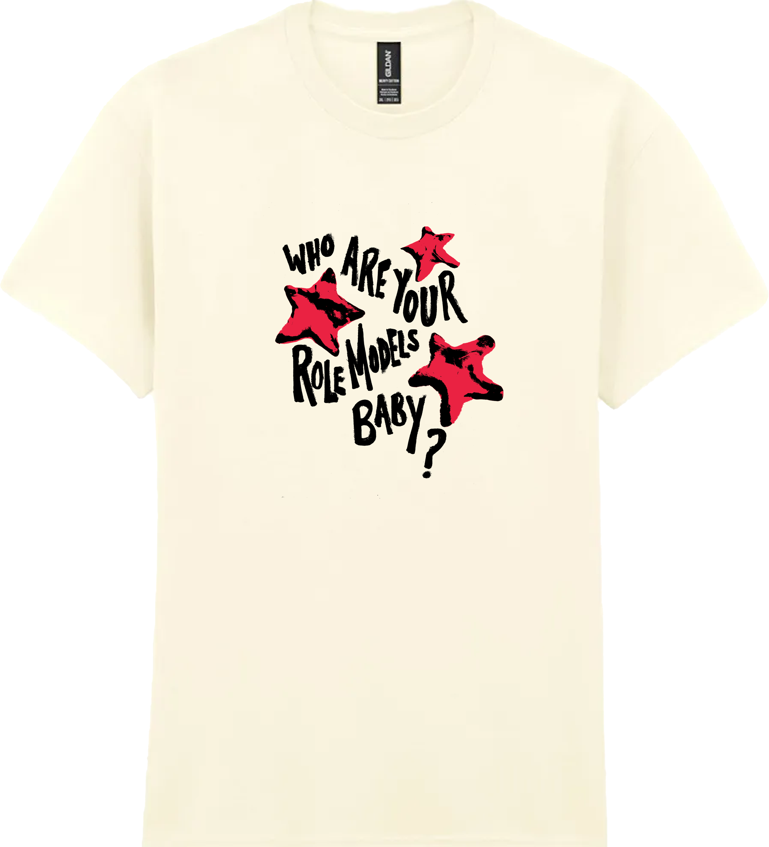
The song’s refrain became the campaign’s central line, as we immediately noticed its catchiness and pop culture relevance. I carried it across the brand: printed on merch, used as recurring copy across social content, and as a call-and-response moment with audiences during live sets, turning the lyric into a unifying thread for the whole era. The tongue-in-cheek comedy of the line worked well with the wit and self-awareness we had shown in our BTS social media videos, again bringing together the personal touch of our generic POV videos with a genuine art concept, showing audiences and industry alike that we could do both to create a distinctive branding and approach to marketing.
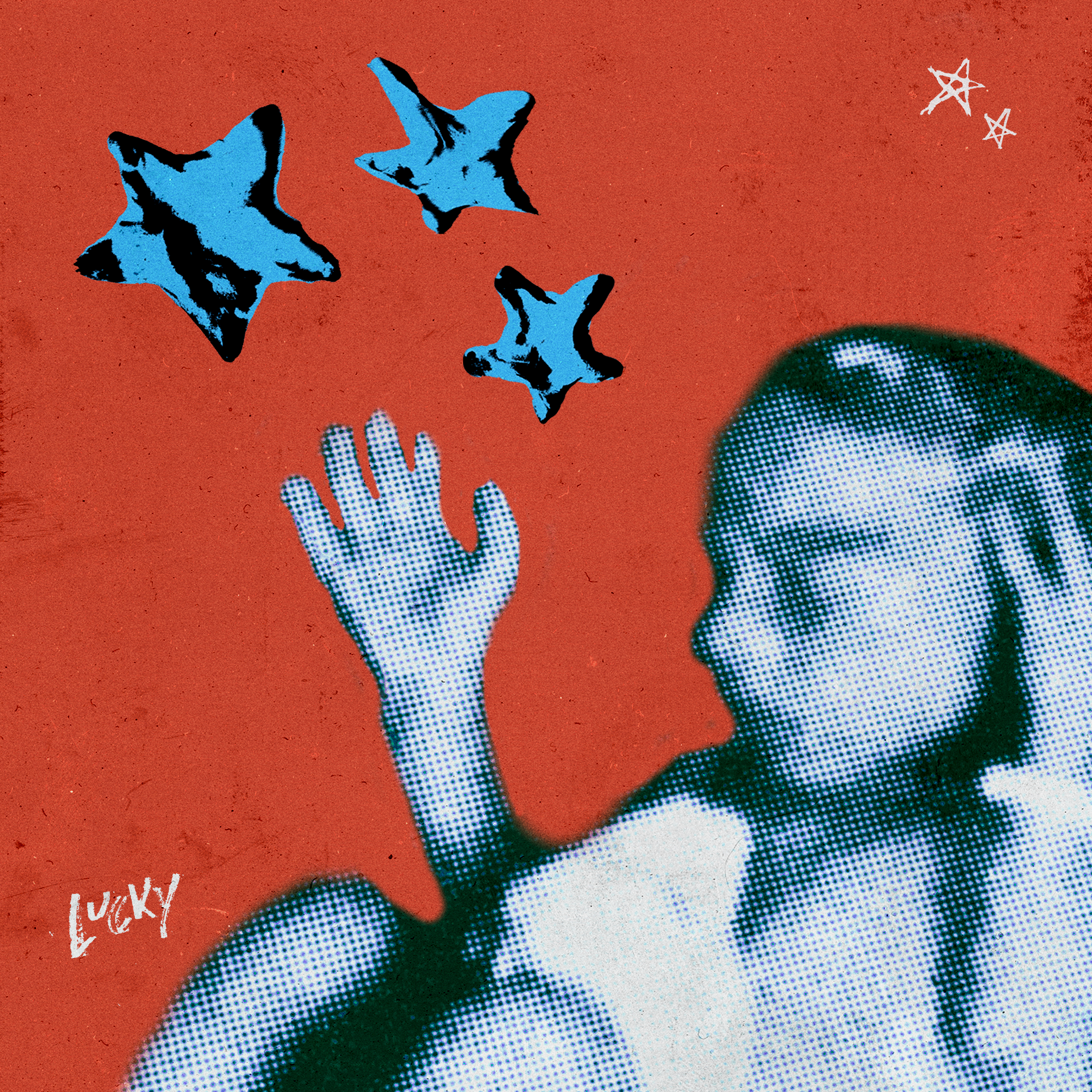
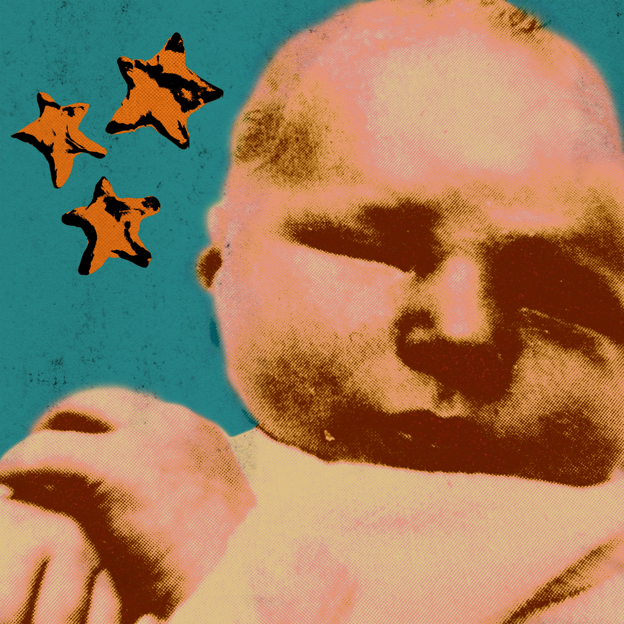
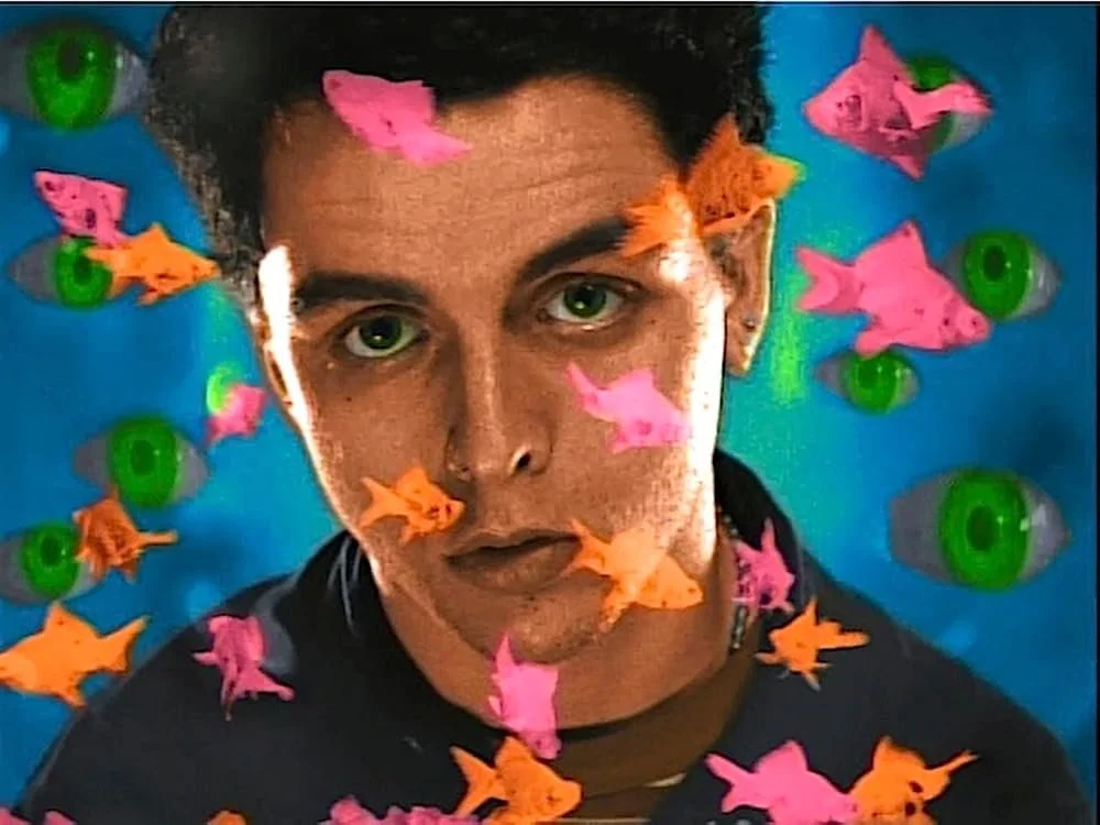
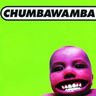
I designed a new pop-art branding: Warhol-esque printing effects, saturated colour, and hand-drawn lettering, referencing the graphic energy of iconic nineties visuals like Green Day's Basket Case and Chumbawumba's garishly memorable Tubthumping. Where the band’s first campaign visuals were moody and muted, this one was about volume, colour, and satire, a contrast that reflected the songwriting itself.
RIP IT UP AND START AGAIN
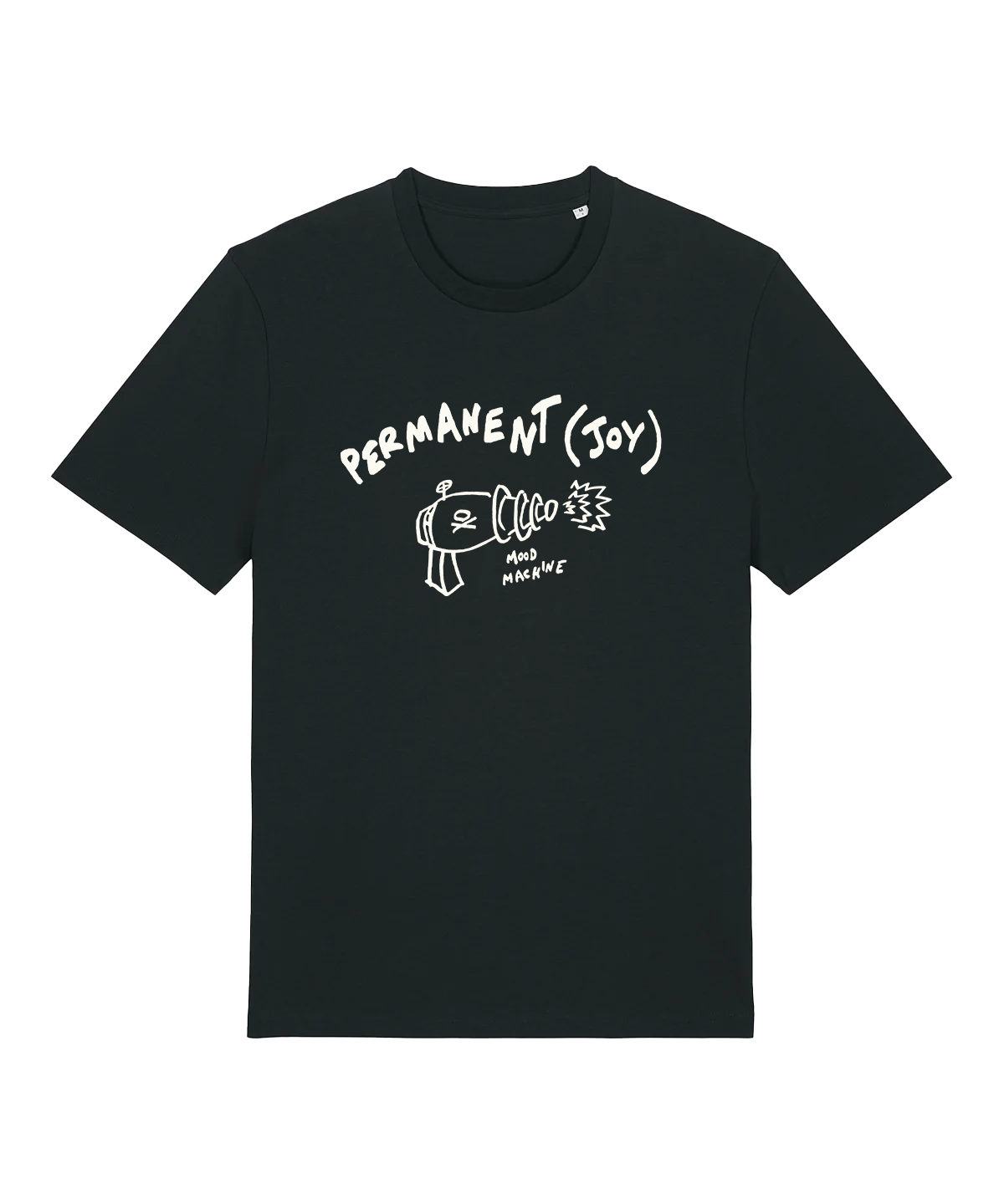
Clockwise from top left: “Role Models” single artwork, campaign merchandise, “Stressed Out” single artwork, “Lucky” single artwork.
WHO ARE YOUR ROLE MODELS, BABY?